Deserting the Details
“The design mistake I see folks make most often is neglecting the details,” says Inspired Home Interiors president Pattie Kelly, IFDA. “It’s the finishing touches that tie all the elements together and make a room feel complete.”
How it looks and feels is important, of course. Blank walls will leave your room feeling cold and devoid of personality. But it also needs to “work.”
Kelly mentions a real-life example: Forgetting to install towel racks in a bathroom. That will leave people awkwardly wondering where to dry their hands or hang their towel, and force you to add a rack in an inopportune spot.
Not Measuring Everything
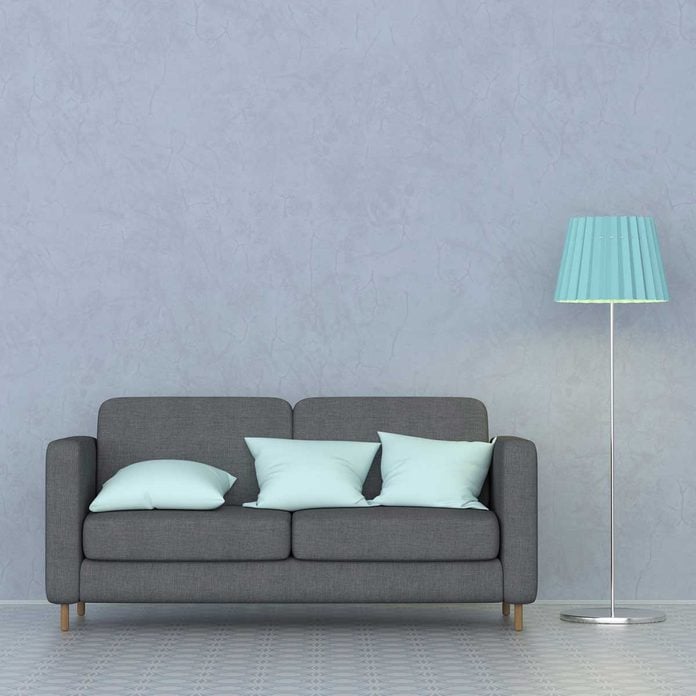
You have to know precisely how much or how little space you’re working with, whether you’re planning furniture, purchasing rugs or choosing artwork.
Besides length and width of your room, consider doorways, stairs, hallways, corners and elevators where furniture or home décor accessories may need to move through. The wrong-sized scale of furniture or art can make a room feel overcrowded or difficult to navigate. Too small, and your room feels like a dollhouse.
“We’ve had several clients who have bought rather expensive, beautiful furniture from other design firms, only to realize at the installation that it doesn’t fit,” says designer Judi Schwarz, ASID. “It’s a nightmare for the designer, as well as the client, often left holding the bag for a costly mistake.”

Your eye will tell you the proportion is off. Don’t ignore that nagging feeling that won’t allow you to enjoy the flow of your room. But when it’s just right? It should feel relaxing and livable — just what you’re looking for.
Relying on Overhead Lighting
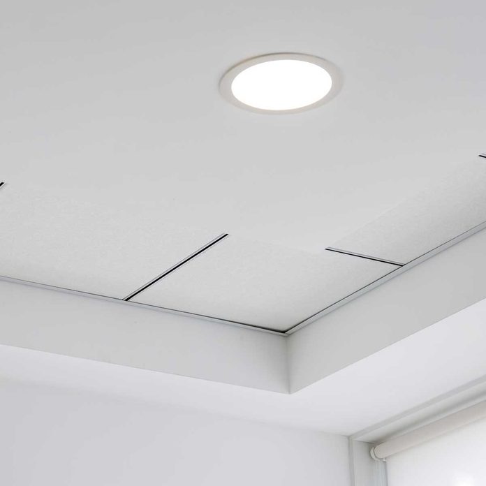
Happy DIY Home founder Jen Stark says using only overhead lighting is a mistake. “It doesn’t offer a lot of illumination, and it’s not very flattering,” she says. Instead, mix ambient, overhead and task lighting throughout your room.
“Use floor lamps, table lamps and sconces to create a warm look,” she says. “These things can all provide more light throughout the room, and it can also make the room — and anyone that sits in it — look better.”
Over-Accessorizing
Too much of a good thing is … just too much.
“Accessories give a living space interest and distinction, and when you use items that truly mean something to you, they provide a deeper connection to your surroundings, speaking volumes about you,” says Heather Higgins, ASID, CID, of Higgins Design Studio. “Unfortunately, it’s not uncommon, over time, to keep adding items without taking anything away, diluting their effectiveness.”
Removing even a few items can make a noticeable difference, she says. Higgins’ quick trick? “One of the simplest ways to instantly refresh a space without any financial investment is to remove all the accessories and put back half to two-thirds of them in different locations or new arrangements,” she says. “This will make the entire room feel new again.”

Miscalculating Chandelier and Pendant Heights
“Selecting an inappropriately-sized chandelier or pendant light for a dining table is a really unfortunate mistake,” Higgins says.
If it’s hung too low, she says, it will obstruct your view or make you feel blinded. And anyone seated could bump their heads while getting up, or while setting or clearing the table. Too high and the proportion of the room will feel strange and uncomfortable, not cozy. It may also throw unflattering shadows.
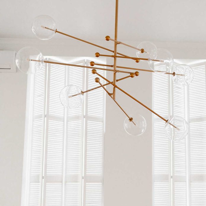
Higgins offers the following guidelines to get it right:
The fixture needs to be proportional to the table and room size.
The fixture must be at least 12 inches narrower than the width of the table surface, or people will hit their head when rising. A diameter of 24 to 30 inches suits most tables seating six to eight.
Two or three fixtures are often better for longer tables. Illuminate the center two-thirds of the table length.
Equally important: The height where the chandelier or pendant light is hung. Position the bottom of a fixture 30 inches above the tabletop in rooms with eight-foot ceilings. For every foot higher than eight feet, increase this distance by three inches.
Being Too Matchy-Matchy
Kelly says your spaces should be accurate reflections of your personal style, not a retail showroom. Matched furniture sets are a chief offender here, most often seen in the bedroom. “I walk into a new client’s bedroom and am hit in the face with matchy-matchy nightstands, dresser, tallboy and bed,” Kelly says.
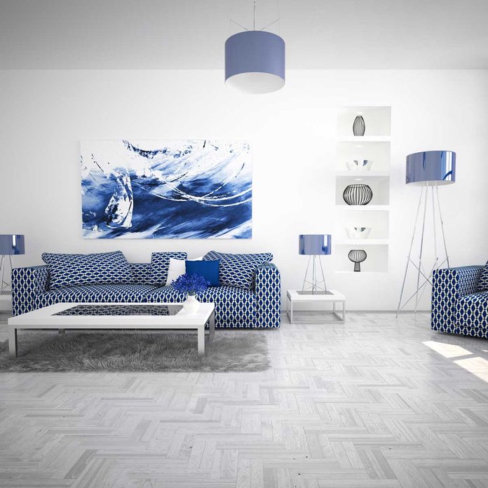
To add personality and thoughtfulness in any room, think coordination, not cloning. Matching nightstands are OK because symmetry is soothing, she says. But overall, she advises that you “find pieces you love that relate to one another, so your room looks more collected over time.”
Already invested in a full set? Consider splitting the pieces throughout different rooms, and personalizing surfaces with your favorite collected items or mixing in textiles, such as runners or throw pillows.
Hanging Artwork Too High
It’s a common problem: Hanging art at the wrong height — usually too high. Art should be hung where everyone can see and enjoy it and where it can visually mingle with the other furnishings and décor in your room.

Jennifer Pacca, ASID, owner of Jennifer Pacca Interiors, offers an easy rule of thumb for placing art: Hang it eye level, with your eye at the center of the piece. Households with adults of varying heights can simply compromise. Bridge any awkward gap created between furniture and art height by strategically placing furnishings, lighting and other elements in closely-hewed groups, she says.
Choosing Paint Color Incorrectly
“Color is a very tricky bit,” says Renaissance Design Consultations interior designer Sam Jernigan, IFDA. All white can fall flat or feel clinical, yellow tones can cast sickly hues, dark colors can make a room feel cramped. It all depends on the goal, the natural light (or lack thereof), and your overall design goals for your space.
Her best tip: Opt for some color, versus no or all-neutral color, at least on a focal wall.
“Selecting paint colors from those wee strips can be a boondoggle, so the best insurance for any painting project is to invest in a few quarts of whatever you’re considering and then do a good sized brush-out on a key wall,” she says.
That’s not all: Add a second coat, so you’re evaluating the finished color accurately. And check your samples in daylight and evening hours, as colors interact with the lighting. Don’t forget to think about what time of day you’re most frequently using that room.
Undersizing Area Rugs
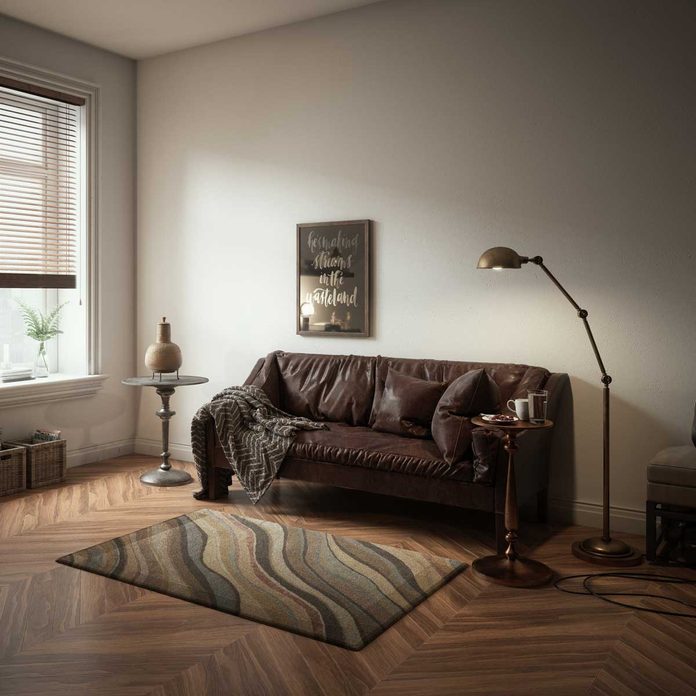
“It’s a very common decorating mistake to use postage stamp-sized rugs,” Stark says. In general, your rug is too tiny if it can’t fit the room’s key furniture pieces. In a dining room, that means it should fit your table and all its chairs. In a bedroom, it should create a comfortable walkway all around the bed (no need to include the nightstands).
And in the living room, your area rug is too tiny if it can’t fit all of the room’s furniture on it, not just the coffee table. It is OK to cheat, however. Try placing just the front legs of your bigger furnishings, such as the sofa and chairs, on the rug’s edge.
source: familyhandyman


